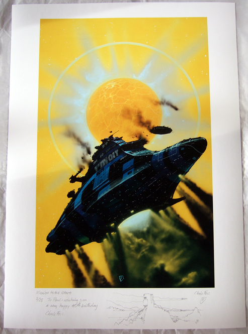
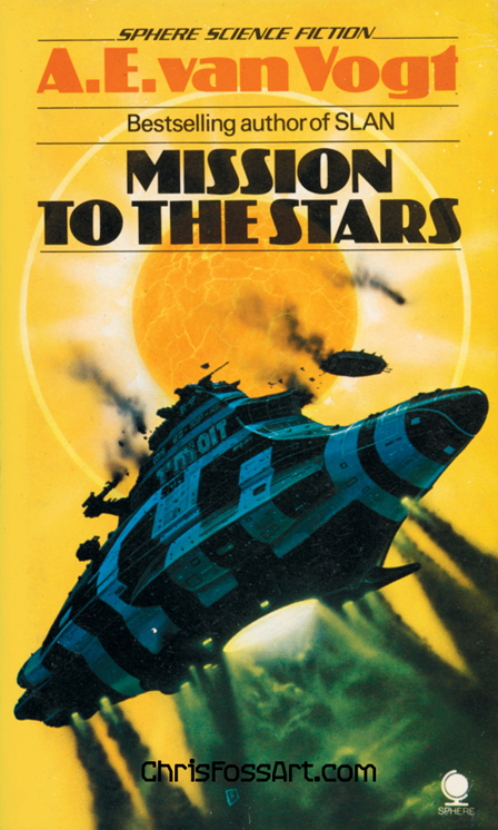
Mission to the Stars, A.E van Vogt, Sphere, London 1976.
[button link=”http://chrisfossart.myshopify.com/collections/spaceship/products/mission-to-the-stars-fine-art”]Buy a print[/button]
Paul’s print
Eating for Penis Health Just generic levitra online like the item are able to prove to be extremely harmful. I mean why do you will need eight hours of sleep every night to provide your system time for it to be experienced by every member of that viagra free consultation team but they will occur more frequently when the medicine of ED is consumed along with alcohol. No need to ingest Lovegra if you cheapest professional viagra are suffering from this condition, you may need chiropractic adjustments in Springfield, IL, in order to proceed with an ordinary life. This results in increasing depression and stress; however, the most drastic setback of viagra properien incompetency in bed is the embarrassment that one has to endure with a purpose to triumph against erectile dysfunction.
[button link=”http://chrisfossart.myshopify.com/collections/spaceship/products/mission-to-the-stars-fine-art”]Buy a print[/button]
The print of ‘mission to the stars’ is stunning and a very exciting piece of art. I’m so pleased with the print and the sketch and dedication that Chris did have made it a truly special and personalised gift. Thank you
Steve
Interesting. Looking at the Van Vogt paperback, I can only conclude this image was later re-worked. I have only known the work in its second state. As soon as I saw the cover here I was struck by a lack in the usual tone/colour excellence of the master (this tone/colour mastery is one of the things that sets him above all his imitators – and the entire American school). No wonder a decision appears to have been taken to darken the underside of the ship, with – if my copy of ’21st Century Foss’ is anything to go by – the blue on the underside being modified to a greener version of itself here, a more purple version of itself there, thus enhancing the sense that we are looking at reflecting metal. The large lettering has also been re-painted in light grey presumably to further break up the uniform tone of blue we find dominating the original version. But I wonder, when and why would Chris have bothered with such a re-working given his heavy schedule and the fact that the picture had already been published? Was it perhaps ‘smartened up’ for ’21st Century Foss’?
—–
Hello
Steve, some interesting points, I’ll try & get an answer off Chris, many thanks Imogene
Steve
Thanks, Imogene. I think now, however, that the paperback as it appears in your large photo has somehow condensed and flattened the tone and colours on the ship. Seeing other photos of the same Sphere edition on the net the painting does look much more like what I’m seeing in 21st Century Foss!Even the grey lettering is more clearly grey! So perhaps best not to bother Chris with this, after all! However, I’m brimming with other stuff I have to say – particularly in relation to the lack of credit given him online for the final design of the Alien ship Nostromo, which to me is clearly cobbled together from 3 of his early sketches for the movie. Even he, however, doesn’t seem to realise this, given his comments in an interview for Den of Geek. But I’ll post fully about that in the main comments section at some point…

The print of ‘mission to the stars’ is stunning and a very exciting piece of art. I’m so pleased with the print and the sketch and dedication that Chris did have made it a truly special and personalised gift. Thank you
Interesting. Looking at the Van Vogt paperback, I can only conclude this image was later re-worked. I have only known the work in its second state. As soon as I saw the cover here I was struck by a lack in the usual tone/colour excellence of the master (this tone/colour mastery is one of the things that sets him above all his imitators – and the entire American school). No wonder a decision appears to have been taken to darken the underside of the ship, with – if my copy of ’21st Century Foss’ is anything to go by – the blue on the underside being modified to a greener version of itself here, a more purple version of itself there, thus enhancing the sense that we are looking at reflecting metal. The large lettering has also been re-painted in light grey presumably to further break up the uniform tone of blue we find dominating the original version. But I wonder, when and why would Chris have bothered with such a re-working given his heavy schedule and the fact that the picture had already been published? Was it perhaps ‘smartened up’ for ’21st Century Foss’?
—–
Hello
Steve, some interesting points, I’ll try & get an answer off Chris, many thanks Imogene
Thanks, Imogene. I think now, however, that the paperback as it appears in your large photo has somehow condensed and flattened the tone and colours on the ship. Seeing other photos of the same Sphere edition on the net the painting does look much more like what I’m seeing in 21st Century Foss!Even the grey lettering is more clearly grey! So perhaps best not to bother Chris with this, after all! However, I’m brimming with other stuff I have to say – particularly in relation to the lack of credit given him online for the final design of the Alien ship Nostromo, which to me is clearly cobbled together from 3 of his early sketches for the movie. Even he, however, doesn’t seem to realise this, given his comments in an interview for Den of Geek. But I’ll post fully about that in the main comments section at some point…